Friday, November 30, 2018

M4 Analyze Week 2 Lecture

This week we continued exploring the use of open source software (OSS).  We used last week's Food Desert Shapefiles of our chosen Study Area, Fort Myers for me, and prepared them for the wild wild web using Mapbox to expose these features as Tilesets so they could be consumed by a web map.  Leaflet-js, a leading third-party JavaScript framework for making mobile-friendly web maps, was used and was configured to consume our published Mapbox Tilesets and present them on a Food Desert web page.  It was a bumpy road writing the code-behind files but in the end, I was able to develop, design and harness these two OSS technologies in creating a web map.  It's a Wild Wild Web out there!

Here is what we did in this week's Lecture
• Learned more about open sourced programs: OpenStreetMap and Mapbox
• Explored the credibility of volunteered geographic information (VGI)
• Transitioned Feature shapefiles into Mapbox Tileset for internet usage
• Created an interactive web map using Leaflet to visually communicate Food Desert locations

Here is what we did in this week's Lab
This week's lab consisted of two downloads: lab exercise to follow and a process summary document to update and answer as we follow the lab instructions.  The lab involved working through Leaflets London Quick-start tutorial, which provided a fundamental exercise to creating a basic web-map and how to draw shapes.  It was an easy and fun exercise.  Nothing real technical to follow.  I copied and pasted the code snippets as I worked through the tutorial.  Using Mapbox was more of a challenge.  I still just copied and pasted the snippets from Mapbox examples, but understanding how to map the configuration setting from my Tilesets into HTML template code was definitely harder than the Leaflet exercise.  Same goes for the blue upper right buttons to toggle layers.  There was no problem finding plenty of online examples posted on the Mapbox site.  But the configuration took time.

In the end, I developed a good understanding that allowed me to quickly set up my Fort Myers Food Desert map seen below.  The map below was my main deliverable for this week.  I really enjoyed using open source software (OSS) along with my Ubuntu and Chromebook devices.  The web-page can be found on my student Internet folder.  I tried to add a layer control button, but I was unsuccessful at layering the control into this map.


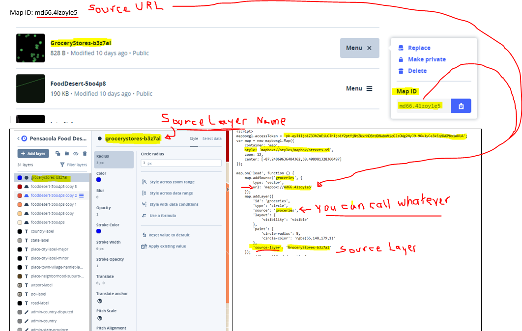
Let's first talk about the feature in this map, Food Deserts, which is defined as an area with a grocery store more than 1-mile away.  This data was created using a census 2010 shapefile data from the US Census Bureau.  I isolated these Fort Myers polygons by clipping them out of the US Census Data using QGIS and a Fort Myers Boundary file that I downloaded from a Lee County GIS data website.   I also used QGIS to extract a point centroid layer from the census tract layer.   I determined which census tracts were more than 1-mile away from the nearest grocery store by using the grocery store layer that I created with the help of Google to extract the longitude and latitude values from searching Google.  When found, I stored the grocery store name, address, longitude, and latitude in an Excel table which I then imported into ArcMap using the Display XY Data option and save the result as a grocery point shapefile.  Then I used the grocery layer and the census centroid layer as inputs to the Near Tool in ArcMap.  The tool has a Search Radius setting that was configured to 1-mile.  After the tool was run, it added additional fields to the census centroid shapefile.  The attribute portion of the shapefile (.dbf) was then opened with excel and saved off as a near.csv file.  Using QGIS the Census tract shapefile was joined to the near.csv file using a common geoid field.  Then it was possible for QGIS to select and save off Food Desert features that had a NEAR_DIST value of -1.  It was then possible to invert the selection to save off a Food Oasis layer.  These three features (grocery stores, Food Desert, and Food Oasis) were then converted into Tilesets using Mapbox and published so it could be consumed by a web-page.  Using Mapbox It was also possible to create and publish a light gray template basemap.

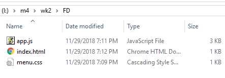
Now let's talk about the file components of the web-map: index.html, app.js, and menu.css.
Separation of concern, or SoC, is a software design principle I used to layout the web-page into layers and components.  For GIS users the concept of layers is learned early.  The main reason I used it was to share my web-page layout with co-classmates.  This principle really helps with reducing complexity into a series of manageable code-behind files.  In addition, it removes the clutter so page layout is easy to view and maintain.  The web-page (HTML file) layout is pretty simple with just two main layers: a Look and feel (CSS file) layer and a logic (JavaScript file) layer.  See all three files below.
Another advantage of using SoC is that it hides the important details of the layer in a separate file.  Encapsulation is the technical term for hiding the important details in a separate file.  The details of the HTML file below show the use of Mapbox resources in the Head section and two additional references I created: menu.css and app.js.


What was challenging this week?
I'm guessing the basic Leaflet template for creating a TileLayer is high on the list.  Mapbox has several third-party templates that are easily copied and pasted within the Mapbox interface, but Leaflet seems to be missing from the main interface.  However, it is defined in the Mapbox documentation in the Publish overview under Third party.  Below is a screen-shot of the basic template.
From within Mabox, below is a series of screenshots that illustrate how to get access to copy paste various types of integration URLs, which provide the detailed syntax for converting a Mapbox Tileset into a native object for the selected third-party solution of choice.  Unfortunately, the detailed syntax for Leaflet integration was not so easy to discover.  This was the frustrating part of the project for several classmates.  The lab exercise screenshots were from more than a year ago and yes, the instructions were not the best.  But this lab illustrated a real-world example of what we will likely experience on the job.  No doubt we will have to follow someone else's workflow that was horribly documented and maybe a software update caused it to break.  For me, this was a great real-world experience of tackling a debugging and troubleshooting task to resolve a reported application down scenario.  Getting to view the various ways the syntax changed between the different third-party helped me discover with the help of google find various solutions that served as workarounds until I finally found the leaflet template above.


Helpful Tips
I used various spreadsheets and readme text files to help me remember the various important configuration settings.  Below are a few examples I used this week.


In summary, my Fort Myers Food Desert web map was created using a combination of open source software and commercial software.  At first, I was a little surprised to see Food Deserts defined in my hometown, Fort Myers.  I suppose a trend of lower-income residents might explain this Food Desert pattern.  I actually drove around these areas and noticed there were lots of ethnic corner stores and fast-food establishments.  These fast-food areas are also defined as Food Swamps.  Are these Food Swamps the New Food Deserts?  Maybe it's not the lack of grocery stores that are making us fat.

BTW, I was able to implement the layer control in the map below.  Right now it is a struggle trying to add additional layers where you have to reference multiple libraries.  The key was having to work in the page loading event to circumvent error of some variable not being defined.  It's definitely tricky have to be mindful of the pipeline lifecycle of how Javascript parses our lines of javascript.


To create the toggling effect used in this map, I created and published two Tilesets.  One Tileset contains the light gray canvas and three symbology layers that represent the Food Desert Data.  The second Tileset contains the grocery store and Food Oasis layers, which is configured to the blue toggle control buttons.  I overlayed the grocery points and Food Oasis polygon Tileset over the basemap/Food Desert Tileset.  It was tricky pulling off the toggle control.  Having to represent the Food Desert in three separate layers complicated the toggling examples I found online.  There is an alternative approach in Mapbox to apply multiple colors by writing a new type of expression, but at this time, I was not successful.  Hence the choice to include the Food Desert layer with the light gray basemap and use another Tileset for toggling.  I'm looking forward to understanding how to correctly use the expression and redo this workaround for the correct way to toggle multiple base maps and overlays.

Thursday, November 22, 2018

Module 4: Open Sourced - Analyze Week 1 Lab

Greetings and get ready for some more open-source software (OSS) goodness.  This week we continue to use QGIS as our main GIS desktop software and explore a few more beneficial open source resources: Mapbox, Leaflet, Color Brewer, Geocoder.

Topics covered this week are an introduction to MapBox Studio (layer hosting) and Leaflet (Web mapping), QGIS plug-ins, symbology modification, layer control, and open cage geocoder.

This week begins with using the previously created Escambia Food Desert shapefile to illustrate how to create a map symbology required for a web map.
This weeks lab is comprised of two parts:
  • Part A - create symbology and obtain the code for Food Desert data using two popular OSS resources: MapBox and Color Brewer
  • Part B - create, edit and launch a basic web map template from our student I-drive using the Leaflet framework to create a functional web map and develop skills needed to duplicate efforts for data in your chosen study area.

So what happened this week?
     • Create Map Symbology using MapBox and Color Brewer
     • Downloaded the latest (1.3.4) stable release (August 21, 2018) of Leaflet
     • Installed and explored the Leaflet Tutorials to make several web-maps
     • Obtain data for your study area and create layers in QGIS
          -food desert layer and grocery stores (required to complete Analyze Week 2 lab)
    • Review the Report Week Presentation Guidelines document closely:
          - Create a static QGIS Basemap for your location
          - Create a table of census data relevant to your study area
    • Write an outline for the Study Area section

What was learned this week?
   • How to create tiled layers with MapBox
   • How to use Color Brewer to create a color scheme to style the tiled layers
   • How to create and edit HTML web maps using Leaflet to consume MapBox layers
   • How to create a geo-coder web component and how to consume the component in a web map

In Summary

This week MapBox was used to create tile layers from geo-data modified in QGIS.  From the Food Desert layer, five styles were created in MapBox.  The color scheme was created with the help of Color Brewer.  Via MapBox, a web map template was available after publishing the tiled layers.  It included all the necessary tokens to map the initial map very easy stand-up.  A simple style was also created for a grocery store layer.  After the layers were published, the Leaflet framework was used to reference the published layers to make several web maps.  It includes all lab requirements and then some extras associated with creating a layout using some new layout code snippet from a Flexbox guide found from CSS-TRICKS, https://css-tricks.com/snippets/css/a-guide-to-flexbox/.
Hosted on Student Drive: http://students.uwf.edu/md66/m4/wk2/FoodDesert.html
Next, we'll integrate the symbology layers hosted by Mapbox.  In the meantime, I did create a template HTML page that Mapbox provides after publishing the tile layer.  Below is that simple template markup that I copied and pasted into a blank HTML web-document.  The interactive map can be found here, http://students.uwf.edu/md66/mapbox/symbology.html

http://students.uwf.edu/md66/mapbox/symbology.html
And regarding the Lecture portion of this week, I started thinking about my study area.  Since I work in Naples, FL, I originally decided on a Study Area of Naples.  However, I decided to use my local area as my Study Area, City of Fort Myers.  I searched the city of Fort Myers website and easily found a boundary file for the city and locating grocery stores was also pretty easy using Google and Bing maps.  Census Data was also an easy download from the web.  After a few Google searches, I located 2010 Tiger/Line files from the US Census Bureau website.  After a little geodata wrangling, I created two layers, food desert, and grocery store.  Then using my two layers, I quickly created a static QGIS Basemap of the City of Fort Myers.  I also wrote an outline of my selected Study Area and started planning my Food Desert analysis and project presentation.  Below is the QGIS map I created of my Fort Myers, FL Food Desert Analysis map.


Below are the same features used in the above QGIS project viewed via ArcMap with World Topo as basemap.  I just wanted to show a comparison of the two GIS desktop applications rendering the same features.

The obstacle for me this week was remembering the steps on how to do the near analysis thats starts off creating a comma separated value (.csv) file from ArcMap that is used in QGIS to establish a join that allows access to the near analysis results.  After some time of reviewing an earlier lab, I ran the tool and updated my Ft Myers census points layer to include the additional fields.  Below is what my basic Food Desert Statistics look like for the City of Fort Myers.

And below is a screenshot from QGIS of my Fort Myers Census Tracts with some added styling based on 2010 population Census data. The Green area is the Food Oasis region, which the near analysis tool marked as some value greater than -1 in a "NEAR_DIST" field.  The -1 value was an indication of a Food Desert, meaning the distance from the center (centroid) of a Census Tract was more than 1-mile to a grocery store.  The Food Desert Layer was symbolized based off a "POP10" field I created from aggregating Census Block populations for the Census Tracts that make up my study area.  Next is to create a layout project, which is similar to creating a layout view in ArcMap. 
I also need to remove some unused layers and make last minute symbology changes once I have a visualization to review.


Sunday, November 18, 2018

Module 4: Open Sourced - Prepare Week Lab

Hooray, it's the last project of the Semester!   

The last module, Module 4 (M4), is titled: 
Open Sourced: From Analysis to Communication in the Age of Web Mapping

In this last module, we think about the distance it takes to travel from a residency (Point A) to the nearest grocery store (Point B).  Spatially imagine an area that encapsulates the distance from Point-A to Point-B.  When in an urban setting, if this distance is greater than 1-mile, then we define an area known as a "Food Desert".  And for a rural setting, if this distance is over 10 miles, then we also defined this area as a "Food Desert".  If the distance is less than 1-mile (for urban setting) and less than 10-miles (for rural setting), then we have described an area known as a "Food Oasis".  These two terms (Food Desert and Food Oasis) describe terms related to a Food Access problem in America.  Food Access is one of the main topics of Module 4 (M4).  Exploring open-source software (OSS) is the other main topic of M4.

The problem of food access is related to the limited access to supermarkets, supercenters, grocery stores, or other sources of healthy and affordable food may make it harder for some Americans to eat a healthy diet. How we chose to measure food access in this project was to measure the distance between two points: local grocery stores and the center of US Census Tracts within a study area.  Census Tracts take into account the concept of residential neighborhoods where a population of people resides.  When this distance between the food source and center of residence (population) is greater than 1-mile, this area is known as a "Food Desert".    Visa-Versa, if the distance is less than 1-mile, then the area is known as a "Food Oasis".  Regardless of the distance problem, other associated issues to Food Access are transportation to poor food, few planned parcels to grow food options, more fast-food stores, a higher percentage of processed food availability compared to fresh fruits and vegetables that result in a poor lifestyle due to complications such as diabetes, high blood pressure, and overweight issues.  And as a whole, all these issues make for an expensive obstacle.

Spatially, this distance of Food Access can be visualized via a map with the help of a geographic information system (GIS).  Instead of using a commercial software solution such as ESRI, this module will utilize open-source software (OSS) as the technology.  OSS is a type of computer software in which the source code is released under a license in which the copyright holder grants users the rights to study, change, and distribute the software to anyone and for any purpose.  During the first week of this project, we prepared data using an OSS called QGIS (previously known as Quantum Geographical Information Systems).  QGIS is a popular open-source GIS with advanced capabilities. Here is a series of tutorials and tips that shows how to use it to tackle common GIS problems.   I also used this link -->  QGIS Learning Resources for other materials to help me learn QGIS this week.

This week I started off performing some basic navigation and progressed to using some geoprocessing tools.  Then I created a new Print Layout to experience how to make standalone physical maps.  The obvious benefit of using Open Source software like QGIS over a commercial solution (ArcDesktop) is the cost of ownership.  Cost of software training is also an expense to consider.  Based on my experience (greater than 5 years) with using QGIS this week to perform basic GIS tasks, I found the learning curve to be short and easy to learn.  So considering the training cost to using QGIS, a strong background in ArcMap should make for an easy transition to using this software.

In Summary,

These last few weeks of the semester, the Special Topics in GIS course will focus on the issues of Food Access and the exploration of GIS open-source software (OSS).

The Goals for this week are: Learn about Food Deserts and Explore Open Source Software, QGIS
Some Objectives explored this week are as follow:
  • Read about Food Access 
  • Create a Discussion blog about Food Desert
  • Explore the use of QGIS to create a basic map and more involved Food Access map for the Pensacola study area. 
  • Practice preparing data for further analysis
  • Use data from PartA to create a modified version of UWF's "Own Your Map" lab using QGIS to explore the basics of using the OSS.
  • Use data from PartB to explore some advanced analytic functions within QGIS to a create the map shown below
  • Create a PowerPoint document in preparation for a presentation.
  • Create an internal discussion post to help create a better learning environment.
Below is the basic Map created using QGIS.  Is it a modified version of the UWF's "Own Your Map" mentioned above.

Below is a deliverable map I created using the instructions from this weeks prepare Lab guide.  The lab was pretty easy to follow and QGIS was a breeze to use to create the map below that depicts an analysis of Food Access in Pensacola, FL.  Looks like Pensacola could benefit from some strategically placed grocery stores, provided the Sales Projections, Zoning, Planning, and Regulatory factors are in-favor.


Like all software, crashes do occur.  And I like the experience of a QGIS crash.