Topics covered this week are an introduction to MapBox Studio (layer hosting) and Leaflet (Web mapping), QGIS plug-ins, symbology modification, layer control, and open cage geocoder.
This week begins with using the previously created Escambia Food Desert shapefile to illustrate how to create a map symbology required for a web map.
This weeks lab is comprised of two parts:
- Part A - create symbology and obtain the code for Food Desert data using two popular OSS resources: MapBox and Color Brewer.
- Part B - create, edit and launch a basic web map template from our student I-drive using the Leaflet framework to create a functional web map and develop skills needed to duplicate efforts for data in your chosen study area.
So what happened this week?
• Create Map Symbology using MapBox and Color Brewer
• Downloaded the latest (1.3.4) stable release (August 21, 2018) of Leaflet
• Installed and explored the Leaflet Tutorials to make several web-maps
• Obtain data for your study area and create layers in QGIS
-food desert layer and grocery stores (required to complete Analyze Week 2 lab)
• Review the Report Week Presentation Guidelines document closely:
- Create a static QGIS Basemap for your location
- Create a table of census data relevant to your study area
• Write an outline for the Study Area section
What was learned this week?
• How to create tiled layers with MapBox
• How to use Color Brewer to create a color scheme to style the tiled layers
• How to create and edit HTML web maps using Leaflet to consume MapBox layers
• How to create a geo-coder web component and how to consume the component in a web map
In Summary
This week MapBox was used to create tile layers from geo-data modified in QGIS. From the Food Desert layer, five styles were created in MapBox. The color scheme was created with the help of Color Brewer. Via MapBox, a web map template was available after publishing the tiled layers. It included all the necessary tokens to map the initial map very easy stand-up. A simple style was also created for a grocery store layer. After the layers were published, the Leaflet framework was used to reference the published layers to make several web maps. It includes all lab requirements and then some extras associated with creating a layout using some new layout code snippet from a Flexbox guide found from CSS-TRICKS, https://css-tricks.com/snippets/css/a-guide-to-flexbox/. |
| Hosted on Student Drive: http://students.uwf.edu/md66/m4/wk2/FoodDesert.html |
 |
| http://students.uwf.edu/md66/mapbox/symbology.html |
Below are the same features used in the above QGIS project viewed via ArcMap with World Topo as basemap. I just wanted to show a comparison of the two GIS desktop applications rendering the same features.
The obstacle for me this week was remembering the steps on how to do the near analysis thats starts off creating a comma separated value (.csv) file from ArcMap that is used in QGIS to establish a join that allows access to the near analysis results. After some time of reviewing an earlier lab, I ran the tool and updated my Ft Myers census points layer to include the additional fields. Below is what my basic Food Desert Statistics look like for the City of Fort Myers.
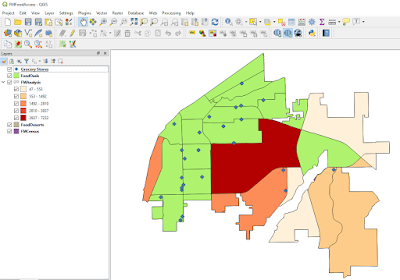
And below is a screenshot from QGIS of my Fort Myers Census Tracts with some added styling based on 2010 population Census data. The Green area is the Food Oasis region, which the near analysis tool marked as some value greater than -1 in a "NEAR_DIST" field. The -1 value was an indication of a Food Desert, meaning the distance from the center (centroid) of a Census Tract was more than 1-mile to a grocery store. The Food Desert Layer was symbolized based off a "POP10" field I created from aggregating Census Block populations for the Census Tracts that make up my study area. Next is to create a layout project, which is similar to creating a layout view in ArcMap.
I also need to remove some unused layers and make last minute symbology changes once I have a visualization to review.


No comments:
Post a Comment