Friday, December 7, 2018

M4 Report Week

Hooray, it’s the last project of the Semester!   

This last phase of the project is dedicated to reporting and closing out all activities across the project phases.  What I did this week as basically check that all the planned work assignments (Data Preparation and Analysis) were accomplished.  And then report how much Project work was accomplished.   I thought of this project as having 3-phases or milestones (Prepare, Analysis, and Report) with various Project objectives and I established a simple Project scope statement: "Estimate the Food Desert condition for Fort Myers, FL", which was achieved.  Below is an image of a simple Excel Project Timeline that I configured and downloaded here.

This blog and PowerPoint presentation is a form of communication deliverable to assist in informing the project owner (Instructor) of the project status and deliverables to expect.  The majority of the project was accomplished mainly using open source GIS software’s: QGIS, Mapbox, and Leaflet.  Esri’s ArcMap map product was used during the analysis phase to create a near.csv file to allow QGIS users select Food-Deserts.

Project deliverables consisted of:
  • Simple dynamic custom web map - http://students.uwf.edu/md66/m4/wk3/fd/index.html
  • PowerPoint presentation (how to) - https://drive.google.com/file/d/1T70laY-3UmOHatuvjoaRLAKF4limK-i_/view?usp=sharing
  • Stationary map (see below)


Here is a basic checklist to help keep track of the Closeout Process.
  • Make sure all required work is complete
  • Obtain approval by the project’s sponsor and customer for the completed work
  • Formally recognize the completion
  • Capture lessons learned:  Document what was done well so it can be repeated.  Also, document what could have been done better.
  • Complete a Simple Excel Project Timeline with milestones (Free Download)

 Project Overview:
Food Deserts are areas that lack access to affordable, healthy food options (fresh fruits and vegetables) is limited because grocery stores are too far away or do not exist.  Transportation to secure healthy food options can also be an issue that causes a lack of fresh healthy food if residents don’t have access to transportation.  My project involved the investigation of the City of Fort Myers, Florida for the presence of Food Deserts.  The analysis involved the collection and aggregation of population values from the 2010 Census data.  The center of census tracts was evaluated to determine their proximity to grocery stores.  If the distance was greater than 1-mile that Census tract was annotated to identify it as a Food Desert.  A custom interactive web map was created to increase the visual experience for web users to inspect and evaluate the limited Food Access locations.  I created several web map examples as I discovered how to use the Leaflet javascript library.  Here is a full-screen version web map where I modified the Cascading Style Sheets (CSS) to create an exploratory vision of the earlier map. 

I used this web map to explore and test different ways to use newer versions of the Mapbox API endpoints, which are required to reference the Food Desert Tilesets I created in Mapbox Studio.  I discovered these newer version endpoints from emailing Mapbox support and from reading the Mapbox blog.  The Mapbox documentation was also very helpful.  Here is one of my bookmark on the subject of retrieving tiles - https://www.mapbox.com/api-documentation/#retrieve-tiles.  And this section on Styles, https://www.mapbox.com/api-documentation/#styles, was also very helpful.

Overall, my analysis of Fort Myers (Lee County) resulted in 31% of the population (58,706) being impacted by food desert conditions. And compared to the USDA Food Atlas, my result is within the range (6 - 40%) indicated on the Food Atlas Map.  How might this data be helpful?  The data could be used to help inform city planners for future developments of grocery stores or healthy food alternatives closer to impacted neighborhoods. This education about limited access to healthy food options may be the best way to help reduce this food access problem and help future land development plan better for a healthier community.


Friday, November 30, 2018

M4 Analyze Week 2 Lecture

This week we continued exploring the use of open source software (OSS).  We used last week's Food Desert Shapefiles of our chosen Study Area, Fort Myers for me, and prepared them for the wild wild web using Mapbox to expose these features as Tilesets so they could be consumed by a web map.  Leaflet-js, a leading third-party JavaScript framework for making mobile-friendly web maps, was used and was configured to consume our published Mapbox Tilesets and present them on a Food Desert web page.  It was a bumpy road writing the code-behind files but in the end, I was able to develop, design and harness these two OSS technologies in creating a web map.  It's a Wild Wild Web out there!

Here is what we did in this week's Lecture
• Learned more about open sourced programs: OpenStreetMap and Mapbox
• Explored the credibility of volunteered geographic information (VGI)
• Transitioned Feature shapefiles into Mapbox Tileset for internet usage
• Created an interactive web map using Leaflet to visually communicate Food Desert locations

Here is what we did in this week's Lab
This week's lab consisted of two downloads: lab exercise to follow and a process summary document to update and answer as we follow the lab instructions.  The lab involved working through Leaflets London Quick-start tutorial, which provided a fundamental exercise to creating a basic web-map and how to draw shapes.  It was an easy and fun exercise.  Nothing real technical to follow.  I copied and pasted the code snippets as I worked through the tutorial.  Using Mapbox was more of a challenge.  I still just copied and pasted the snippets from Mapbox examples, but understanding how to map the configuration setting from my Tilesets into HTML template code was definitely harder than the Leaflet exercise.  Same goes for the blue upper right buttons to toggle layers.  There was no problem finding plenty of online examples posted on the Mapbox site.  But the configuration took time.

In the end, I developed a good understanding that allowed me to quickly set up my Fort Myers Food Desert map seen below.  The map below was my main deliverable for this week.  I really enjoyed using open source software (OSS) along with my Ubuntu and Chromebook devices.  The web-page can be found on my student Internet folder.  I tried to add a layer control button, but I was unsuccessful at layering the control into this map.


Let's first talk about the feature in this map, Food Deserts, which is defined as an area with a grocery store more than 1-mile away.  This data was created using a census 2010 shapefile data from the US Census Bureau.  I isolated these Fort Myers polygons by clipping them out of the US Census Data using QGIS and a Fort Myers Boundary file that I downloaded from a Lee County GIS data website.   I also used QGIS to extract a point centroid layer from the census tract layer.   I determined which census tracts were more than 1-mile away from the nearest grocery store by using the grocery store layer that I created with the help of Google to extract the longitude and latitude values from searching Google.  When found, I stored the grocery store name, address, longitude, and latitude in an Excel table which I then imported into ArcMap using the Display XY Data option and save the result as a grocery point shapefile.  Then I used the grocery layer and the census centroid layer as inputs to the Near Tool in ArcMap.  The tool has a Search Radius setting that was configured to 1-mile.  After the tool was run, it added additional fields to the census centroid shapefile.  The attribute portion of the shapefile (.dbf) was then opened with excel and saved off as a near.csv file.  Using QGIS the Census tract shapefile was joined to the near.csv file using a common geoid field.  Then it was possible for QGIS to select and save off Food Desert features that had a NEAR_DIST value of -1.  It was then possible to invert the selection to save off a Food Oasis layer.  These three features (grocery stores, Food Desert, and Food Oasis) were then converted into Tilesets using Mapbox and published so it could be consumed by a web-page.  Using Mapbox It was also possible to create and publish a light gray template basemap.

Now let's talk about the file components of the web-map: index.html, app.js, and menu.css.
Separation of concern, or SoC, is a software design principle I used to layout the web-page into layers and components.  For GIS users the concept of layers is learned early.  The main reason I used it was to share my web-page layout with co-classmates.  This principle really helps with reducing complexity into a series of manageable code-behind files.  In addition, it removes the clutter so page layout is easy to view and maintain.  The web-page (HTML file) layout is pretty simple with just two main layers: a Look and feel (CSS file) layer and a logic (JavaScript file) layer.  See all three files below.
Another advantage of using SoC is that it hides the important details of the layer in a separate file.  Encapsulation is the technical term for hiding the important details in a separate file.  The details of the HTML file below show the use of Mapbox resources in the Head section and two additional references I created: menu.css and app.js.


What was challenging this week?
I'm guessing the basic Leaflet template for creating a TileLayer is high on the list.  Mapbox has several third-party templates that are easily copied and pasted within the Mapbox interface, but Leaflet seems to be missing from the main interface.  However, it is defined in the Mapbox documentation in the Publish overview under Third party.  Below is a screen-shot of the basic template.
From within Mabox, below is a series of screenshots that illustrate how to get access to copy paste various types of integration URLs, which provide the detailed syntax for converting a Mapbox Tileset into a native object for the selected third-party solution of choice.  Unfortunately, the detailed syntax for Leaflet integration was not so easy to discover.  This was the frustrating part of the project for several classmates.  The lab exercise screenshots were from more than a year ago and yes, the instructions were not the best.  But this lab illustrated a real-world example of what we will likely experience on the job.  No doubt we will have to follow someone else's workflow that was horribly documented and maybe a software update caused it to break.  For me, this was a great real-world experience of tackling a debugging and troubleshooting task to resolve a reported application down scenario.  Getting to view the various ways the syntax changed between the different third-party helped me discover with the help of google find various solutions that served as workarounds until I finally found the leaflet template above.


Helpful Tips
I used various spreadsheets and readme text files to help me remember the various important configuration settings.  Below are a few examples I used this week.


In summary, my Fort Myers Food Desert web map was created using a combination of open source software and commercial software.  At first, I was a little surprised to see Food Deserts defined in my hometown, Fort Myers.  I suppose a trend of lower-income residents might explain this Food Desert pattern.  I actually drove around these areas and noticed there were lots of ethnic corner stores and fast-food establishments.  These fast-food areas are also defined as Food Swamps.  Are these Food Swamps the New Food Deserts?  Maybe it's not the lack of grocery stores that are making us fat.

BTW, I was able to implement the layer control in the map below.  Right now it is a struggle trying to add additional layers where you have to reference multiple libraries.  The key was having to work in the page loading event to circumvent error of some variable not being defined.  It's definitely tricky have to be mindful of the pipeline lifecycle of how Javascript parses our lines of javascript.


To create the toggling effect used in this map, I created and published two Tilesets.  One Tileset contains the light gray canvas and three symbology layers that represent the Food Desert Data.  The second Tileset contains the grocery store and Food Oasis layers, which is configured to the blue toggle control buttons.  I overlayed the grocery points and Food Oasis polygon Tileset over the basemap/Food Desert Tileset.  It was tricky pulling off the toggle control.  Having to represent the Food Desert in three separate layers complicated the toggling examples I found online.  There is an alternative approach in Mapbox to apply multiple colors by writing a new type of expression, but at this time, I was not successful.  Hence the choice to include the Food Desert layer with the light gray basemap and use another Tileset for toggling.  I'm looking forward to understanding how to correctly use the expression and redo this workaround for the correct way to toggle multiple base maps and overlays.

Thursday, November 22, 2018

Module 4: Open Sourced - Analyze Week 1 Lab

Greetings and get ready for some more open-source software (OSS) goodness.  This week we continue to use QGIS as our main GIS desktop software and explore a few more beneficial open source resources: Mapbox, Leaflet, Color Brewer, Geocoder.

Topics covered this week are an introduction to MapBox Studio (layer hosting) and Leaflet (Web mapping), QGIS plug-ins, symbology modification, layer control, and open cage geocoder.

This week begins with using the previously created Escambia Food Desert shapefile to illustrate how to create a map symbology required for a web map.
This weeks lab is comprised of two parts:
  • Part A - create symbology and obtain the code for Food Desert data using two popular OSS resources: MapBox and Color Brewer
  • Part B - create, edit and launch a basic web map template from our student I-drive using the Leaflet framework to create a functional web map and develop skills needed to duplicate efforts for data in your chosen study area.

So what happened this week?
     • Create Map Symbology using MapBox and Color Brewer
     • Downloaded the latest (1.3.4) stable release (August 21, 2018) of Leaflet
     • Installed and explored the Leaflet Tutorials to make several web-maps
     • Obtain data for your study area and create layers in QGIS
          -food desert layer and grocery stores (required to complete Analyze Week 2 lab)
    • Review the Report Week Presentation Guidelines document closely:
          - Create a static QGIS Basemap for your location
          - Create a table of census data relevant to your study area
    • Write an outline for the Study Area section

What was learned this week?
   • How to create tiled layers with MapBox
   • How to use Color Brewer to create a color scheme to style the tiled layers
   • How to create and edit HTML web maps using Leaflet to consume MapBox layers
   • How to create a geo-coder web component and how to consume the component in a web map

In Summary

This week MapBox was used to create tile layers from geo-data modified in QGIS.  From the Food Desert layer, five styles were created in MapBox.  The color scheme was created with the help of Color Brewer.  Via MapBox, a web map template was available after publishing the tiled layers.  It included all the necessary tokens to map the initial map very easy stand-up.  A simple style was also created for a grocery store layer.  After the layers were published, the Leaflet framework was used to reference the published layers to make several web maps.  It includes all lab requirements and then some extras associated with creating a layout using some new layout code snippet from a Flexbox guide found from CSS-TRICKS, https://css-tricks.com/snippets/css/a-guide-to-flexbox/.
Hosted on Student Drive: http://students.uwf.edu/md66/m4/wk2/FoodDesert.html
Next, we'll integrate the symbology layers hosted by Mapbox.  In the meantime, I did create a template HTML page that Mapbox provides after publishing the tile layer.  Below is that simple template markup that I copied and pasted into a blank HTML web-document.  The interactive map can be found here, http://students.uwf.edu/md66/mapbox/symbology.html

http://students.uwf.edu/md66/mapbox/symbology.html
And regarding the Lecture portion of this week, I started thinking about my study area.  Since I work in Naples, FL, I originally decided on a Study Area of Naples.  However, I decided to use my local area as my Study Area, City of Fort Myers.  I searched the city of Fort Myers website and easily found a boundary file for the city and locating grocery stores was also pretty easy using Google and Bing maps.  Census Data was also an easy download from the web.  After a few Google searches, I located 2010 Tiger/Line files from the US Census Bureau website.  After a little geodata wrangling, I created two layers, food desert, and grocery store.  Then using my two layers, I quickly created a static QGIS Basemap of the City of Fort Myers.  I also wrote an outline of my selected Study Area and started planning my Food Desert analysis and project presentation.  Below is the QGIS map I created of my Fort Myers, FL Food Desert Analysis map.


Below are the same features used in the above QGIS project viewed via ArcMap with World Topo as basemap.  I just wanted to show a comparison of the two GIS desktop applications rendering the same features.

The obstacle for me this week was remembering the steps on how to do the near analysis thats starts off creating a comma separated value (.csv) file from ArcMap that is used in QGIS to establish a join that allows access to the near analysis results.  After some time of reviewing an earlier lab, I ran the tool and updated my Ft Myers census points layer to include the additional fields.  Below is what my basic Food Desert Statistics look like for the City of Fort Myers.

And below is a screenshot from QGIS of my Fort Myers Census Tracts with some added styling based on 2010 population Census data. The Green area is the Food Oasis region, which the near analysis tool marked as some value greater than -1 in a "NEAR_DIST" field.  The -1 value was an indication of a Food Desert, meaning the distance from the center (centroid) of a Census Tract was more than 1-mile to a grocery store.  The Food Desert Layer was symbolized based off a "POP10" field I created from aggregating Census Block populations for the Census Tracts that make up my study area.  Next is to create a layout project, which is similar to creating a layout view in ArcMap. 
I also need to remove some unused layers and make last minute symbology changes once I have a visualization to review.


Sunday, November 18, 2018

Module 4: Open Sourced - Prepare Week Lab

Hooray, it's the last project of the Semester!   

The last module, Module 4 (M4), is titled: 
Open Sourced: From Analysis to Communication in the Age of Web Mapping

In this last module, we think about the distance it takes to travel from a residency (Point A) to the nearest grocery store (Point B).  Spatially imagine an area that encapsulates the distance from Point-A to Point-B.  When in an urban setting, if this distance is greater than 1-mile, then we define an area known as a "Food Desert".  And for a rural setting, if this distance is over 10 miles, then we also defined this area as a "Food Desert".  If the distance is less than 1-mile (for urban setting) and less than 10-miles (for rural setting), then we have described an area known as a "Food Oasis".  These two terms (Food Desert and Food Oasis) describe terms related to a Food Access problem in America.  Food Access is one of the main topics of Module 4 (M4).  Exploring open-source software (OSS) is the other main topic of M4.

The problem of food access is related to the limited access to supermarkets, supercenters, grocery stores, or other sources of healthy and affordable food may make it harder for some Americans to eat a healthy diet. How we chose to measure food access in this project was to measure the distance between two points: local grocery stores and the center of US Census Tracts within a study area.  Census Tracts take into account the concept of residential neighborhoods where a population of people resides.  When this distance between the food source and center of residence (population) is greater than 1-mile, this area is known as a "Food Desert".    Visa-Versa, if the distance is less than 1-mile, then the area is known as a "Food Oasis".  Regardless of the distance problem, other associated issues to Food Access are transportation to poor food, few planned parcels to grow food options, more fast-food stores, a higher percentage of processed food availability compared to fresh fruits and vegetables that result in a poor lifestyle due to complications such as diabetes, high blood pressure, and overweight issues.  And as a whole, all these issues make for an expensive obstacle.

Spatially, this distance of Food Access can be visualized via a map with the help of a geographic information system (GIS).  Instead of using a commercial software solution such as ESRI, this module will utilize open-source software (OSS) as the technology.  OSS is a type of computer software in which the source code is released under a license in which the copyright holder grants users the rights to study, change, and distribute the software to anyone and for any purpose.  During the first week of this project, we prepared data using an OSS called QGIS (previously known as Quantum Geographical Information Systems).  QGIS is a popular open-source GIS with advanced capabilities. Here is a series of tutorials and tips that shows how to use it to tackle common GIS problems.   I also used this link -->  QGIS Learning Resources for other materials to help me learn QGIS this week.

This week I started off performing some basic navigation and progressed to using some geoprocessing tools.  Then I created a new Print Layout to experience how to make standalone physical maps.  The obvious benefit of using Open Source software like QGIS over a commercial solution (ArcDesktop) is the cost of ownership.  Cost of software training is also an expense to consider.  Based on my experience (greater than 5 years) with using QGIS this week to perform basic GIS tasks, I found the learning curve to be short and easy to learn.  So considering the training cost to using QGIS, a strong background in ArcMap should make for an easy transition to using this software.

In Summary,

These last few weeks of the semester, the Special Topics in GIS course will focus on the issues of Food Access and the exploration of GIS open-source software (OSS).

The Goals for this week are: Learn about Food Deserts and Explore Open Source Software, QGIS
Some Objectives explored this week are as follow:
  • Read about Food Access 
  • Create a Discussion blog about Food Desert
  • Explore the use of QGIS to create a basic map and more involved Food Access map for the Pensacola study area. 
  • Practice preparing data for further analysis
  • Use data from PartA to create a modified version of UWF's "Own Your Map" lab using QGIS to explore the basics of using the OSS.
  • Use data from PartB to explore some advanced analytic functions within QGIS to a create the map shown below
  • Create a PowerPoint document in preparation for a presentation.
  • Create an internal discussion post to help create a better learning environment.
Below is the basic Map created using QGIS.  Is it a modified version of the UWF's "Own Your Map" mentioned above.

Below is a deliverable map I created using the instructions from this weeks prepare Lab guide.  The lab was pretty easy to follow and QGIS was a breeze to use to create the map below that depicts an analysis of Food Access in Pensacola, FL.  Looks like Pensacola could benefit from some strategically placed grocery stores, provided the Sales Projections, Zoning, Planning, and Regulatory factors are in-favor.


Like all software, crashes do occur.  And I like the experience of a QGIS crash.


Friday, October 19, 2018

Statistics Module 3b - Regression Analysis - Analyze Phase

During the lecture portion of this project, I learned that regression analysis is a process of analyzing one known variable against a set of independent/explanatory variables found to explain and be related to a dependent variable.  Regarding the term "regression", I associated it with the repeated sampling of explanatory variables which results in a model that best explains the dependent variable (regressing to a mean that best explains the dependent variable).  The outcome of regression analysis reports how well or poorly the model predicts the known variable and which of the statistics had the most impact on the model’s accuracy. By removing the worst performing explanatory variables and re-running the model, the underlying regression equation gets better/smarter at forecasting more reliable results that explain the dependent variable. Does Regression Analysis sound like a learning process (Machine Learning)?  It sure does to me!

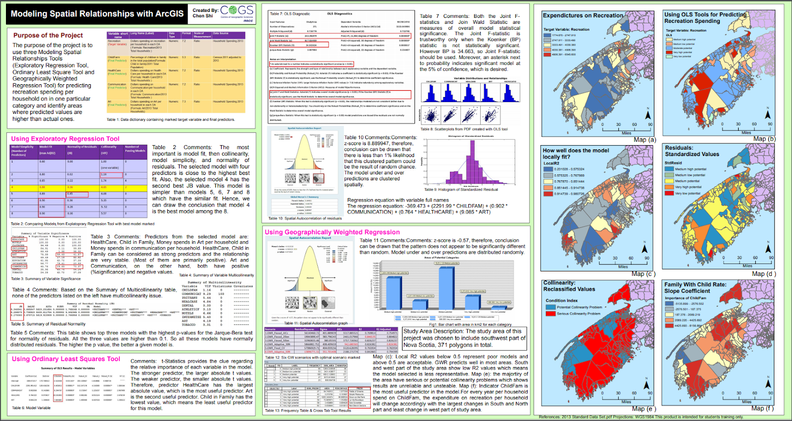
In general, the lecture material was hard for me to wrap my mind around all the moving parts associated with regression analysis.  We learned about three types of regression analysis: explanatory, Geographically Weighted Regression (GWR), and Ordinary Least Squares (OLS).  I found a nice project online that compared these three type of regression that helped me out this week.  The project is called "Modeling Spatial Relationships with ArcGIS" and it was created by Chen Shi.


What I discovered was that regardless of the type of regression, they all have in common a core concept: to examine the influence of one or more independent (socioeconomic factors) variables on a dependent (Meth Lab Density) variable.  I choose to think of regression as a line of best fit, which is a line called Y-hat.  In statistics, there is a term called Line-hat, which refers to predictions of true values.  Hence, a prediction of Y for a given value of x equates to an expression describing the best fit line through some observed/actual values.  Below is an example of a regression line:
                 Y-hat = y-intercept + coefficient(slope) of x
The above equation may look familiar.  I'm referring to the point-slope equation of a line often taught in algebra: y = mx + b  (The two bivariant variables are x (dependent variable) and y (independent variable), m is the slope (coefficient), and b is the y-intercept).  But the point-slope equation is missing a variable referred to as the error portion of the dependent variable that isn't explained by the model, which is the difference between the actual and predicted values.  The missing variable is called residuals.  Below is a vocabulary list to help explain the equation that forms the model being built by the regression method and what we learned these past two weeks:
  • Dependent variable (Y): what we are trying to model or predict (Meth Lab Density) 
  • Explanatory variables (X): variables we believe influence or help explain the dependent variable (e.g., population, education, gender, income, etc.)
  • Coefficients (ß): values reflecting the relationship and strength of each explanatory variable to the dependent variable.
  • Residuals (ε): the portion of the dependent variable that is not explained by the model (the model under and over-predictions).

Using the variables above, a simple and more informative regression equation would look like the following: Y = ßX + ε.  In actuality though, the equation is more complicated and it more resembles the graphic below.  It's the gist of what we explored this week.


During the Lab portion of this project, I learned how to leverage ArcMap's Spatial Analyst extension to reveal Spatial Statistics Tools and Toolsets to perform regression analysis.  The lab was tedious to perform; but it allowed me to run the OLS tool which showed me how to model, examine, and explore spatial relationships, to better understand the socioeconomic factors (age, income, sex, etc) behind observed spatial patterns that explained the location of 176 known meth lab seizures.  It was a mentally painful experience to really try and understand all the statistics going on in this lab.  And no real class involvement made for a poor learning experience.

The end Goal (Why) for this Project phase:
  1. Understand the core concept of regression analysis
  2. Learn about three types of regression, Exploratory, GWR, and OLS
  3. Explore how to use OLS to limit 29 variable candidates to make predictions

The Objectives (What) were as follows:
  • Perform and explore the method of Ordinary Least Squares to limit 29 variable candidates to make predictions
  • Write Methods & Results sections of a final report paper
  • Create a map showing StdResidual results from OLS model
  • Continue to learn about linear regression and establish a better understanding of this predictive type of analysis

What was learned during the last two weeks?
  • Y-hat  () = is a symbol that represents the predicted equation for a line of best fit in linear regression.
  • The equation takes the form: = a + bx, where b is the slope and a is the y-intercept.
  • Y-bar = the mean(avg) value of Y (dependent variable)
  • SSR = Σ(y-hat - y-bar)² (explained deviation)
  • SSE = Σ()² (unexplained deviation)
  • Limiting 29 candidate factors to 7 was painful!

What was challenging during the last two weeks?
My challenge this week was discovering how to limit 29 variable candidates.  More specifically, identifying my clues to interpreting the OLS results was probably the biggest issue.  Deciding which explanatory variable (EV) is to stay or be removed drove me crazy at first.  This part of the lab was demanding for me to visualize and explain.  The basic premise was easy: to show how known Meth Labs busts are dependent on some limited selection of explanatory socioeconomic factors such as the 2010 population per square mile, the Median age of males, percentage of whites, a percent of uneducated, etc..  But trying to understand the statistics behind the complex relationships involved in the regression analysis was painful for me.

What happened during the last two weeks?
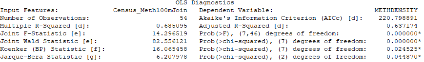
The bulk of this weeks lab exercise involved exploring several checks through the use of the OLS regression tool that analyzed how 29 independent/explanatory US Census variables explained a dependent variable, Meth Lab Seizures.  The aim was to select the best 5 to 10 independent variables that explained the location of 176 known Meth Lab seizures/busts by running the OLS tool and evaluating the regression tool's OLS Summary and Diagnostic results via the guidance of the six checks, which are questions.  How well these questions were answered was the tricky part for me this week.  I removed 22 of the original 29 independent variables.  Below are the 7 best explanatory variables I selected using the six checks.


The lab combined checks 1-3 into one task that resulted in either a removing or leaving an explanatory variable based on if it helped or hurt the relationship of explaining the dependent (Meth Lab Density) variable.  Below are snap-shots of working through each of the 6 questions.  The order of answering these six questions is very important!

Question 1 - Are independent variables helping or hurting my model?
This task involved checking to see that all of the explanatory variables have statistically significant coefficients (value > 0.4).  Two columns, Probability, and Robust Probability measure coefficient statistical significance. An asterisk next to the probability tells you the coefficient is significant. If a variable is not significant, it is not helping the model, and unless I thought the particular variable is critical, I removed it. When the Koenker (BP) statistic is statistically significant, you can only trust the Robust Probability column to determine if a coefficient is significant or not. Small probabilities are “better” (more significant) than large probabilities.

Question 2 - Is the relationship between the independent and dependent variables what I expected?
This task involved checking to see that each coefficient value has the “expected” sign and not indicating a slope of zero.  A positive coefficient indicates the relationship is positive; a negative coefficient means the relationship is negative.  In the beginning, I noticed lots of high negative and positive values which I used to weigh my decision to keep the variable.  I used lower values as my clue to remove the variable.  And when considering the variable, I would ask myself, does this value seem reasonable for this variable to either increase or decrease the MLD.

Question 3 - Are there redundant explanatory variables?
This task involved checking for redundancy among the explanatory variables. If the VIF value (variance inflation factor) for any of your variables is larger than about 7.5 (smaller is definitely better), it means that one or more variables are telling the same story. This leads to an over-count type of bias. I used large VIF values to weigh my decision to remove the variable.

Questions 4 - 6 involved OLS result values seen in the OLS Diagnostic portion of the report shown below.


Question 4 - Is my model biased?
This task involved checking the Jarque-Bera Statistic is NOT statistically significant.  The residuals (over/under predictions) from a properly specified model will reflect random noise. Random noise has a random spatial pattern (no clustering of over/under predictions). It also has a normal histogram if you plotted the residuals. The Jarque-Bera check measures whether or not the residuals from a regression model are normally distributed (think Bell Curve). This is the one test you do NOT want to be statistically significant! When it IS statistically significant, your model is biased. This often means you are missing one or more key explanatory variables.

Question 5 - Have I found all the key explanatory variables?
This task involved checking the standard map output of running the OLS tool.  It's a map of the regression residuals representing model over and underpredictions.  Red areas indicate that actual observed values are higher than the values predicted by the model.  Blue areas show where actual values are lower than the model predicted.   Statistically significant spatial autocorrelation in your model residuals indicates that you are missing one or more key explanatory variables.

Question 6 - How well am I explaining my dependent variable?
This task involved checking model performance by using the adjusted R squared value as an indicator of how much variation in your dependent variable has been explained by the model.  the adjusted R squared value ranges from 0 to 1.0 and higher values are a positive indicator of performance.  I watched this value increase from -6.019018 at the beginning to a value of 0.367174 at the end.
The AIC value can also be used to measure model performance. When considering AIC values, the lower the value is a gauge for a better performing model.

Each time I would remove or re-add a variable I would reiterate through the six checks above to determine if the model got better.  This is where lots of patience is required!  ArcMap Help has an "Interpreting OLS results" page that was very helpful.

Additional Consideration - Use GWR to improve the model
When the Koeker test is statistically significant, as it is in my model, it indicates relationships between some or all of your explanatory variables and your dependent variable are non-stationary. This means, for example, that the population variable might be an important predictor of  Meth Lab Density in some locations of your study, but perhaps a weak predictor in other locations. Whenever the Koenker test is statistically significant, it indicates you will likely improve model results by using another statistical method called Geographically Weighted Regression (GWR).
The good news is that once you’ve found your key explanatory variables using OLS, running GWR is actually pretty easy. In most cases, GWR will use the same dependent and explanatory variables you used in running the OLS tool.

What's the Conclusion?

In statistic, standardized residuals (SRs) is the method of normalizing the dataset.  A standardized residual (SR) is a ratio: The difference between the observed Meth Lab Density (MLD) and the expected MLD.  Below is the SR equation to help visualize and explain its definition.  
[ SR = (observed MLD - expected MLD) / √ expected MLD] 

But what does SRs Mean?  The SR is a measure of the strength of the difference between observed and expected MLD values.  After running the OLS tool, it automatically generates a residuals map that I would often review to quickly see if the selected variables helped or hurt the model (the more yellow the better).  In addition, the structure of the map was also helpful in analysing the results of running OLS.  A good model would show a dispersed layout of over and underpredictions.  Looking at the legend of the map below, the orange to red range represents over prediction, meaning the model equation predicts more MLD than actual.  The gray to blue range represents under prediction, meaning the model equation predicts there is less MLD than actual.  There may be a little clumping shown in the map below, but the SR layout/structure is mainly dispersed across the study area, which indicates a good model.  Could it be better?  Absolutely!!  Actually, as I looked at this map, I realized that the handful of observations outside the two main counties (Putnam and Kanawha) could have been the outliers that prevented my model to score higher.  I really wish I noticed this earlier.  I should have tried running my model on just observations made in Putnam and Kanawha counties.  Then maybe my model would have been closer to 1.0.

In summary, this project demonstrated how to better understand some of the factors contributing to the spread of Meth Labs in a few West Virginia counties, by using Ordinary Least Squares (OLS) regression to limit the 29 candidate factors to a subset of 7 factors. The scatterplot matrix tool was used to improve the model by exploring the histograms of candidate explanatory variables that might improve the model. I also noted the Koenker test was statistically significant meaning a switch to using the GWR could result in an improved regression model. When executed successfully, regression analysis could provide a community with a number of important insights to help uncover more meth labs.

References:

  • ZedStatistics, https://www.youtube.com/watch?v=aq8VU5KLmkY&t=558s
  • MathBits, https://mathbits.com/MathBits/TISection/Statistics1/LineFit.htm
  • Interpreting OLS results, http://desktop.arcgis.com/en/arcmap/latest/tools/spatial-statistics-toolbox/interpreting-ols-results.htm
  • AI & Machine Learning, https://www.youtube.com/watch?v=KCkGif6wSMo
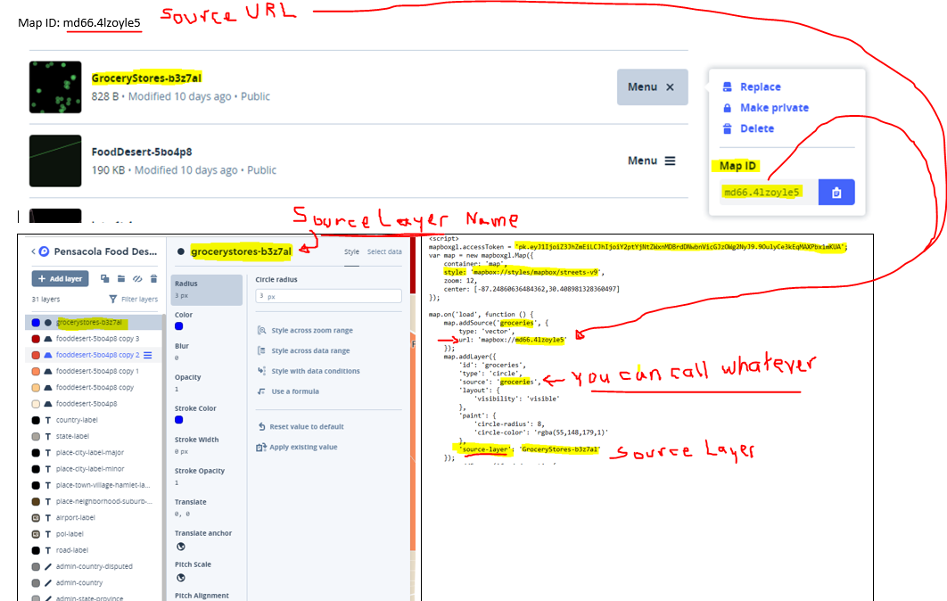
Statistics Module 3a Prepare Data


This week begins a new Project focused on Statistics and issues that are both social and economic, socioeconomic.  The setting is the familiar rolling hills and dense forests of West Virginia (WV).  The study area is Charleston (County Seat), WV including five counties: all of Kanawha and Putnam and 3 extended counties, Clay, Boone, and Lincoln.  The number crunching involves various types (social and economic) of data: population, salary, poverty, Crystal Meth Labs.  The Project goal is a scientific report explaining the results of an analysis that uses GIS to show the facts and figures surrounding a cultural issue, crystal meth.  This week's goal will focus on writing the Introduction and Background sections of the final report.  The lecture involved the following: lecture video and various readings: A Weisheit and Wells article and writing guide were aides used to complete this week's assignment.  The Lab was a five-step exercise that resulted in the map described in summary below.  Here were the five steps:

  1. Obtain the data provided by UWF from Repository drive
  2. Review the data
    1. Busted Meth Labs, point feature class
    2. Census Tract data, polygon feature class
  3. Prepare the Census Data
  4. Join Meth Labs to Census Blocks
  5. Create basemap to augment the provided data


The end Goal (Why) for this project is twofold:
  1. Exposure to ArcGIS Spatial analysis Tools and common methods and learn to apply them to solve real-world problems
  2. Exposure to examining peer-review literature and applying those methods and techniques to a similar project.  

The weekly Objectives (What) were as follows:
  • Write an Introduction section of a final report paper
  • Write a Background section of a final report paper
  • Create a basemap to act as an underlayer to Busted Meth Labs and Census Tracts
  • Start understanding linear regression and establish a visual of this predictive type of analysis

What was learned/remembered this week?
The Shake and Bake process of making Meth may be the easiest to perform, but it is an extremely dangerous game to play!

The process of using independent data (socioeconomic variables) to make predictions based on dependent data (Meth Lab seizures) involves the work that we will be performing and reporting on during this Statistics project.

What was challenging this week?
Understanding the gist of this project in a visual way my biggest challenge this week.
The image below helped me visually refresh my basic understanding of linear regression.
It sure has been a long time remembering the difference between explained deviation (SSR) and unexplained deviation (SSE).  For me, a line of best fit is a good way to understand regression.


Any Weekly Positives?
In a big-picture way, I have a basic understanding of predictive analysis.

In Summary, the main feature in the lab experiment was showcasing the busted meth lab (BML) locations, which was spatially joined with 2010 Census county boundaries.  The Main Study area was created by selecting the two main counties and exporting then off as a separate layer.  Both the BML and Census Layer were provided in this week's lab exercise; and there are sources from US DEA National Clandestine Laboratory Register and Tiger/Census data.  I also created the Extended Study Area to show a parent relationship of all counties (Putnam, Kanawha, Lincoln, Boone, Clay) containing a BML.  To create the basemap, I searched and downloaded the following ancillary features: Incorporated Places (Major Place), which were originally polygons that I converted to points using the feature to point tool and then adding a definition query to filter on features with units greater than 1500; Interstate & US Routes where originally created by WV DOT and derived from Statewide Addressing Member Board (SAMB) 2003 aerial photography.


Songs of the Week

  • Breaking Bad Song of the Week is by the late Johny Cash - "Hurt"
  • Inspired by the Dangerous/Wicked game of making Meth: "Wicked Game" by Chris Isaak
  • When searching the internet with Meth and WV as keywords, Mini Thin SEO scores high.  I never knew this author until now.  He is known as a "hick hop" rapper and raps about life in West Virginia, where crystal meth, moonshine, and Oxycontin are part of the culture. 
    WARNING: his content is Graphic and Heavy language
    • "Meth Labs & Moonshine" from the album "Hillbilly Hustle"

References:
• ZedStatistics, https://www.youtube.com/watch?v=aq8VU5KLmkY&t=558s
• MathBits, https://mathbits.com/MathBits/TISection/Statistics1/LineFit.htm


Friday, October 5, 2018

GIS4930 - Module 2: MTR (Report Week) | Broken Landscape & Feelings

During the last three weeks, I've been reminded of a childhood pollution commercial of a crying Indian (Iron Eyes Cody) that was used as an emotional symbol for a Keep America Beautiful (KAB) organization.   The goal of this original project was to reduce highway litter through a public service announcement (PSA) campaign.  For me, the emotional equivalent for Mountaintop Removal (MTR) has been many documentaries and movies portraying West Virginia natives who at an early age left home, moved on to find life, jobs, themselves, and just do the best they can.  There were other stories of native West Virginians that knew where their home was and stuck it out living with a brokenness inside them as they resisted big business (Coal Industry) and politics from breaking their health, memories, and landscape.  I usually wait to the end to share a song of the week.  This week I’m going to first share a song that has struck a chord with me over the course of this project.   The song is by Miranda Lambert, “The House That Built Me”.   


As I've listened to this song over the past weeks, I made the connection of broken feelings and broken landscape.  I can’t help wonder if a few Appalachian natives feel they can’t ever go home to the same place they remember growing up.  Fortunately, they have their memories, but at the same time have broken feelings inside.  


MTR, Broken Landscape & Feelings ...


Goal (Why):
Here we are at the final milestone (Report Week) of the MTR Project.  Looking at the list of objectives below, I'm reminded of a Project Managment process called Project Closeout that strives to assess the project, ensure completion, and derive any lessons learned to be applied to future projects.    
Because Project Planning has been an important part of working through the MTR project, I've chosen Project Management as the theme for this week.  Earlier I briefly mentioned, "Lessons Learned".  I personally have discomfort for this term.   I find these two words at odds with each other.   For me, the word "lessons" suggest something that is known (somehow) which can be taught/conveyed to other people.  Constructing meaning from so-called project lessons is a challenge for me.  I feel we all construct meaning differently.  We can socially assemble stuff (documents, software, internet searching) to construct meaning or we might attain meaning through facts and information alone.  I'm attempting to make connections of constructing meaning from observations derived from the MTR project.  Actually, I want to suggest a "turn blind eye" concept.  Something should be done to prevent more harm and destruction inflicted by the industrial age, coal dependency, and MTR mining.   

Objectives (What):
  •  Convert reclassified MTR raster to polygon 
  •  Perform an analysis accuracy test using random points 
  •  Conduct a comparative analysis of 2010 MTR data with the 2005 dataset 
  •  Create and share layer packages 
  •  Compile group data into single layer package for group study area (group leaders only). 
  •  Using ArcGIS Online UWF Organization account 
         - Publish MTR Analysis results as a feature service and web map using
  •  Closeout: including 5 deliverables
      - 1. Final MTR Layer
      - 2. Create Package from final MTR Layer map document
      - 3. Complete Process Summary
      - 4. ArcGIS Online Group MTR Analysis Map
      - 5. Link Final Journal Story Map to this Blog 
  •  Convey Project lessons

So what are we going to do with last week's accomplishments this week?

This week is a continuation of last week’s analysis week.  More processes that flow together via inputs and outs.  The input is last week's reclassified image.  To the left is a basic black box diagram. The details of the Process box were explored in this week's three-part lab.  
     Part 1: Edit and Package Reclassified Raster Data (5 Steps)
     Part 2: Publish Group MTR Analysis map on ArcGIS Online UWF Org (5 Steps)
     Part 3: Finish Final MTR Story Map Journal and Blog Post (3 Steps)

So what actually happened during this weeks analysis phase?
Below are some of the GIS tools we used to transform and produce this week's deliverables.
-  Part1, Step 1: Conversion Tools > From Raster > Raster to Polygon. 
-  Part1, Step 2: Analysis Tools > Proximity > Buffer 
-  Part1, Step 2: Analysis Tools > Overlay > Erase
-  Part1, Step 2: Data Management > Features > Multipart To Singlepart
-  Part1, Step 3: Data Management > Sampling > Create Random Point
And below are the two last parts of this busy week
-  Part 2, Publish Group MTR Analysis map on ArcGIS Online UWF Org
    • Make a hosted Feature Service, which I consumed in a web map

-  Part 3, Finish your Final MTR Story Map Journal and Blog Post.


What was learned/remembered this week?
  • Coal, a present from the Mesozoic to the Industrial Age, does harm where it is burned, and where it is dug.
  • Coal use also has some consequences: fossil fuel dependency, environmental costs, human costs, government responses, protection of a coal-miner way of life.
  • MTR inflicts a wound that goes deep and lasts a long time and the scars are very visible.

What was fun and or challenging this week?
Exploring modern cartography design and the era of collaborative GIS was fun and challenging in a creative way.  The mindset associated with these web maps feels different than the static maps I'm used to creating.   Having access to professionally produced basemaps creates a digital canvas that makes storytelling fun.  And learning about Hosted Features and publishing hosted feature layers was a fun section of the lab.  

To the right is a screenshot of an On-Line Esri map that I created using am MTR Hosted Service I created previously.  I planned this map during week one (Data Prep) when I created 4 individual shapefiles for each Group 1 Team member, making sure each layer intersected corresponding Landsat image. I planned to be able to zoom in/out and see the team member that performed the analysis.  Creating labels and adjusting when they are visible was pretty easy.  The whole experience of using ArcGIS OnLine by Esri was fun to explore.  I'm glad we had the extra time to complete this part of the project. Visit the Final MTR Layer map here  (http://arcg.is/1jKPve0) to explore the Group 1 study area.  Be sure to zoom in to see the label popup.

I tried making unsupervised classification a fun experience, but right now that is still a challenge for me.  So I revisited the task of unsupervised classification this week to get some more experience and try to make my MTR Layer larger by marking more of the suspect classes as "MTR".   I still struggle with this task.  
I wish there was a learning video provided to show us how to properly do this task.   I did find some helpful ERDAS Geo-Spatial Tutorials on the youtube channel.  Here is one of those helpful links from a Geospatial Enthusiast that has an embedded video.  
This online resource had a Notes and Tip section that I found helpful.  Clicking the brown Notes and Tips image to the right will take you directly to the resource.


Any Weekly Positives?
We can't undo the past, but we can do something about tomorrow.  And here are a few places that have taken a pledge toward carbon neutrality:  British Columbia (Canadian province),  Costa Rica, Iceland, Maldives,  Norway,  Tuvalu
Sweden, New Zealand, Vatican City.
For a list of more countries striving NOT to follow in the footsteps of fossil fuel dependency, see this link.
https://en.wikipedia.org/wiki/Carbon_neutrality

Costa Rica has just ran on 100 percent renewable energy for 300 days!! Awesome 😊
http://vt.co/sci-tech/innovation/costa-rica-just-run-100-percent-renewable-energy-300-days/


In Summary, this week we utilized several GIS tools to transform a raster file into vector files and used them in a cloud-based GIS mapping platform hosted by Esri to explore modern cartography.  While technology may make it easy to help convey a damaging process like MTR.  We see time and time again that political power can over-turn the right thing to do for our current and future generations.
Putting the technology to the side, I feel it is pretty obvious that MTR mining is wrong for so many reasons and has been wrong for a long time.  And the images and analysis have been presented time and again.  It's time to hold the coal industry accountable for their past and future actions on mother earth.

Please visit my Journal Story Map that attempts to capture the highlights of this MTR project.  And here is my GIS Blog link that I plan to update into the future.


I depart with a few thoughts to ponder.  

  • How would the world be different today if the reliance on fossil fuels were not so deep?  
  • What if knowledge and technology existed around 1860 to exploit a cleaner energy source rather than harnessing the power of ancient suns (peat, the forgotten fossil fuel)?  
  • Could Pollution events like the Great Smog of London in 1952 have been avoided if we learned from the past?  
  • Why did it take so long to understand and take action on past lessons from exploiting and burning coal?

Yes, it's sad that the ignorance of the industrial age inflicted soo much harm and destruction.  But it would be far worse if there where no lessons conveyed.  Some countries can see past the politics and make the right decisions with future generations in mind.  There needs to be a mindset change before the US can start to remove fossil fuels from its traditional way of life.  We can't undo the past, but we the people can do something about tomorrow.  

Project Management (PM) Song of the Week
As a project manager, some time things tend to get out of your control. Even with lots of planning, track budgets, and assign tasks, all you can do is sit back and hope to hear some good news.   And with that in mind, I chose "Tell me something good" by Rufus & Chaka Khan for this weeks PM song of the week.  https://youtu.be/cm_cFzVAoo8


Interesting Tidbits

Iron Eyes Cody (born Espera Oscar de Corti, April 3, 1904 - January 4, 1999) was an Italian-American actor.

Beverage and bottling companies (Anheuser-Busch, Pepsi, Coca-Cola, McDonald's, etc.) sponsored the KAB, Iron Eyes Cody Ad Campaign mentioned above aired on Earth Day in 1971.   Hmmm, maybe their bottles were part of the litter problem??  

For more info on KAB, see https://www.sourcewatch.org/index.php/Keep_America_Beautiful


References:
•  http://desktop.arcgis.com/en/arcmap/latest/tools/cartography-toolbox/simplify-polygon.htm
•  Tell me something good - https://youtu.be/cm_cFzVAoo8
•  Focus Music - https://www.youtube.com/watch?v=5LXhPbmoHmU
•  https://en.wikipedia.org/wiki/Iron_Eyes_Cody
•  https://www.youtube.com/watch?reload=9&v=DQYNM6SjD_o