Thursday, July 18, 2019

GIS5100 - Module 3, Visibility Analysis


Through the eyes of an observer, the perspective geographical areas seen by the observer can be impacted by various obstacles that block the view path to a target. I never realized until this week how involved the study of visibility could be.  What I discovered this week is that visibility could be modeled, analyzed, and applied to a wide variety of useful applications.  This week's lecture introduced the fundamentals of visibility by comparing two basic Visibility principles: Viewshed and Line-of-Sight (LOS), and both 2D and 3D perspectives of viewing visibility.  After completing several lecture videos and several readings, Visibility analysis started to really sink in after working through an Esri Visibility Learning Plan that consisted of 4 web courses which showcased several 3D Features and how to share web layers:
  1. 3D Visualization Using ArcGIS Pro - Certificate
  2. Performing Line of Sight Analysis - Certificate
  3. Performing Viewshed Analysis in ArcGIS Pro - Certificate
  4. Sharing 3D Content Using Scene Layer Packages - Certificate
The Learning Plan reinforced the lecture material and exposed me to several real-world workflows and various geoprocessing tools mainly belonging to the 3D Analyst toolbox and some tools that overlapped into the Spatial Analyst toolbox and various tools within the data management toolbox.  Below is a mashup of learning objectives, tips, and geoprocessing tools used in the web courses.

     3D Visualization Using ArcGIS Pro
        - Side-by-side 2D and 3D maps that can be linked (very cool)
            • Very useful when determining when to use 2D or 3D views
        - Global vs. local scene views
            • Global scenes use a fixed coordinate system, WGS84
            • Global scenes know about Sun's position (Illumination Analysis)
        - Surfaces other than Ground can be visualized by thematic surfaces
            • Examples: temperature, rainfall, snowpack, water-vapor, etc

     Performing Line of Sight Analysis 
        - Construct Sight Lines tool
        - Line Of Sight tool
        - Add Z Information tool
        - Delete Features (Data Management Tools) tool

     Performing Viewshed Analysis in ArcGIS Pro
        - The Viewshed tool is a powerful and flexible geoprocessing tool
            It can be extended to model important real-world scenarios as I describe below
        - Math: Logical Raster Function
          No getting away from raster, which is an output of the Viewshed tool

     Sharing 3D Content Using Scene Layer Packages 
        - Global mode: used for a large extent where the earth curvature is an important
                                 uses Web Mercator (Auxiliary Sphere) or GCS WGS84
        - Local mode: used for a smaller extent where the earth curvature is not important
                               uses a projected coordinate system
        - Same data can be viewed in side-by-side 2D & 3D maps
        - The Multipatch geometry type is used to cover the outer surface of 3D features
        -  Add Surface Information tool
        - Layer 3D to Feature Class tool
        - Feature to 3D By Attribute tool
        - Create 3D Object Scene Layer Package tool (Data Management toolbox)

In Summary: 

Performing Viewshed Analysis in ArcGIS Pro
I liked how the exercise in this course modeled a range of light for new campground lights and how the placement and height of new lighting could be modeled using the Viewshed tool.  In this exercise, the observer height was conceptually the new lights to be installed.  And by increasing the height of the light, the light's ground coverage could be improved. When the observer height was increased from 3 meters to 10 meters, the ground coverage improved dramatically. I think it's a practical way to model real-world scenarios that analyze light placement to determine an effective light installation height.  I can see this type of analysis being submitted as review requirements for various types of planning project reviews such as site development plans (SDPs).

Performing Line of Sight Analysis
For whatever reason, I had line-of-sight bullet analysis in-mind when learning this subject.  Like bullet flight, there are some finer details associated with understanding the visibility between an observer and target points.  The earth's curvature reduces visibility over long distances.  Atmospheric conditions such as atmospheric pressure, density, humidity, elevation, and temperature may cause light to bend up or down which can affect the generation of a sight-line.  And as you might guess, yes there is a curvature tool!

3D Visualization Using ArcGIS Pro
In this course, the visibility problem studied was trying to decide where to stay in the downtown area that had ocean views from a hotel, a nearby shaded park for jogging, and retail stores.  This was another practical use of GIS that was very interesting to perform.  The exercise showed how to convert a 2D map to 3D and symbolize the new scene with photorealistic texture.  I really liked the part of the lab that extruded building polygons by estimating a floor height of 10 ft.  This would be great to visualizing a site development plan or even making a map for a commissioner to better show what was going on in his/her district.  It was also insightful to change the date and time variables to allow the global scene to show calculate and render ground shadow based on the sun's positioning.  I really liked walking through the three different example labs that show how ArcPro could be used to make some interesting cartographic and photorealistic scenes for a wide range of possible applications.

Sharing 3D Content Using Scene Layer Packages
I think by now it is safe to say that viewing data in three dimensions can provide new insights than viewing the same data in two-dimensions.  And by allowing 2D and 3D views to be side-by-side, ArcGIS Pro provides an interesting way to investigate and visualize data in an intuitive and interactive 3D environment from any angle or perspective.  This course continued to reinforce the use of ArcGIS Pro with topics such as the authoring of 3D scenes, displaying 2D data as 3D Layers, Converting 2D data into 3D data, Global and local scene considerations, symbolizing 3D features with multipatch geometry elements and Sharing a 3D scene via ArcGIS Online.
Sharing your efforts of creating a greater sense of realism via the web offers a great way to communicate your 3D scenes.  And this course walked me through the steps of a workflow to publish and share a scene layer package created with ArcGIS Pro.

In Closing

In today's digital world, there are a wide variety of people expecting to find planning and project information online, presented in an easy to understand way. This learning plan illustrated to me how ArcGIS Pro could help the planning and urban community to create and share 2D and 3D maps of real estate development projects and zoning-based development potential for any parcel within their planning project study area. I can see how ArcGIS Pro could help reveal a capacity for new & additional growth, locations likely to support this growth, and potential impacts of urban policy choices.

Saturday, July 13, 2019

GIS 5100 Module 2 - LiDAR: Wetland Delineation

Exploring Elevation: DEM, DSM, and normalized DSM (DSM minus DEM)

This week we learned about watersheds and elevation through applications of airborne light detection and ranging, LiDAR, which is a system where light pulses travel from an airborne platform to the ground.  When these light pulses hit natural and man-made built features, they bounce off the target and return to a sensor (also on the airborne platform) in such way to provide a range of distance measurements to the Earth surface below.  Hence how this LiDAR system got its name.

Digital Surface Model (DSM) - What is a DSM?

Basically, LiDAR delivers a massive point cloud filled with varying elevation values related to features such as the top of builds, tree canopy, and powerlines.  A DSM captures the natural and human-built features on the Earth's surface.

Digital Elevation Model (DEM) - What is a DEM?

A DEM is a bare-earth grid referenced to a vertical datum (geoid), which provides a place to put the zero-measurement with mean sea level.  A smooth DEM is created by filtering out the non-ground pulse returns.  Basically, the human-built and natural features are NOT included in a DEM.

Normalized Digital Surface Model (nDSM) - What is an nDSM?

An nDSM is a derivative product of a DSM and DEM.  It measures the absolute height of features by subtracting the ground: DSM-DEM = nDSM.  In this week's lab, we used the Minus Raster function to create an nDSM layer that we called Height.  Then later in the lab, we used the Height layer to generate the profile of height values to depict a conceptual feel of vegetation across the extent of the raster.  Below is an image of that histogram chart.
The DSM Map below depicts a DEM that I created using the LAS Dataset to Raster geoprocessing tool in ArcGIS Pro 2.4.


The Mashup map below is a concoction of efforts from this week's lab.  It shows elevation side-by-side with canopy density to infer what elevations are associated with tree density and possible soil conditions.


More details of this week's lab can be viewed on a new Esri story map I've been experimenting with this week. It is a work-in-progress story of this week's lab.  It is subject to good and bad decisions as I learn this new way to communicate location.

In Closing

I learned a lot of interesting information about LiDAR and how it is used in various industries like Forestry and Local Government.


Friday, July 5, 2019

GIS-5100 Module 1: Least Cost Path & Corridor Analysis

Overview

Week two of module 1 consisted of two main scenarios, which continued to reinforce the concept of Suitability and Least-Cost Analysis and topics such as Least Cost Path, plus Corridor Analysis.  In scenario 3, I assumed a role as a GIS Analyst working for an oil company planning to construct a pipeline outside of Medford, Oregon.  I'm tasked with performing three analyses that build off each other.  I'm told that each analysis should consider slope, river crossing, and river proximity.  I'm provided all the datasets so that I can perform the following analysis: slope, add cost for crossing rivers, add cost for proximity to rivers, which results in raster outputs of least-cost analysis.  Then I'm to input these least-cost outputs into a workflow involving Corridor Analysis, which takes into account the accumulation of all the possible paths between a source and destination point feature.  Below is the final corridor I managed to create.

Scenario 4

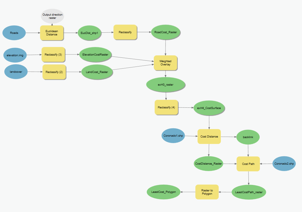
Next came scenario 4, which is the topic of this blog.  The goal is to repeat scenario 3.  But the scenario is a little different.  Now I'm a Park Ranger in the Coronado National Forest asked to model the potential movement of black bears between two protected areas that results in a corridor like performed in scenario 3.  Again, I first create a simple plan to document the basics statements such as Problem, Goal, Objectives, and planned deliverables.  Then I started preparing the data to create a suitability raster and cost surface raster.  Below is what my model looks like.


But now the source and destination are polygons instead of points and the criteria are slightly different. Below is an image depicting the cost surface raster with the source (Coronado1) and destination (Coronado2) areas.


What followed next was the creation of the least cost raster using the Cost Distance and Cost Path tools and the input of the previously created cost surface raster, source feature (Coronado1) and destination feature (Coronado2).  The extended workflow now looks like the image shown below.


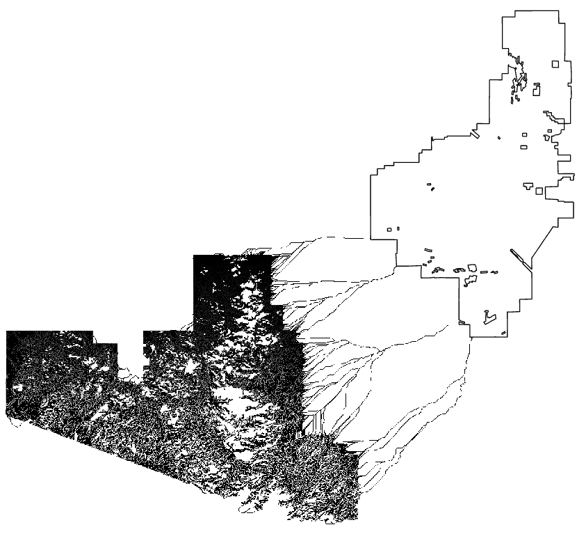
The results of the first Least-Cost Raster shown above between source and destination originally shocked me when I saw all the possible paths created by the model (see image below).

Then I added another Least-Cost Analysis to the above model to consider paths traveling in the opposite direction, destination area (Coronado2) to the source area (Coronado1).


Lastly, running the Corridor Tool was now possible by inputting the two previous Least-Cost Rasters.  Below is the final layout map created with the output of the Corridor tool.


Summary

I've tried to capture the essence of Scenario 4 Lab, which is Suitability Analysis in action.  Suitability Analysis ranks and scores locations/sites based on a few or several weighted criteria.  The number of criteria depends on the intended goal.  The suitability of a candidate location can be ranked based on data variables, site attributes, or proximity to point features.  Working out the details of important criteria with Stakeholders and subject matter experts is vital to configuring and assigning weights to determine scores for each of the potential site locations.

A few high-level assumptions worth mentioning about Suitability Analysis are:

  • The Spatial Analyst extension is required to experiment with processes, procedures, and algorithms of Esri's Suitability Analysis workflow.
  • Some level of comfort is helpful with Model Builder and experimenting with geoprocessing tools (about 190 now and growing).
  • Map Algebra can be tricky and requires some experimentation.
  • Working with rasters and doing math with them might be a new concept, it might require additional effort experimenting with them and the Raster Calculator.

Closing

Although I did not mention the creation of a plan prior to getting started, I created a template so I could quickly document the basic gist of what I'm trying to do.  I can't count the number of times I had to refer to it to reestablish my bearing by reminding myself of the goal.  I often found myself in the weeds working through the lab and venturing down rabbit holes in the quest for understanding.  Having a simple plan-do-act document is my escape hatch out of these fact-finding internet expeditions.

ArcGIS-Pro 2.4 and the Spatial Analyst Extension to model potential corridor movement for black bears between two areas of the Coronado National Forest (Santa Cruz) in Tuscon, Arizona

I'm glad to have gotten my feet wet with Suitability Analysis.  I'm planning new adventures using this technology and hope to apply it with scenarios of my own in the near future.


Thursday, July 4, 2019

GIS-5100 Module 1: Understanding Suitability Analysis & Getting to know the Weighted Overlay Tool

Week one consisted of two main scenarios, which introduced me to the concept of Suitability and Least-Cost Analysis and topics such as Boolean Suitability in both Vector and Raster, rating locations in Raster, Least Cost Path, and Corridor Analysis, and many more topics related to GIS-focused approaches to Suitability Analysis.  This blog is specific to scenario 2, which put me in a position as a GIS Analyst for a property developer.  The supporting lab was quite involved with approximately 15 defined deliverables (30 deliverable for the entire Module).  I really liked learning about the various types of GIS-based processes and means of creating a workflow to model a real-world system to meet the needs of a stakeholder, Land Developer Firm. ( hmmm, sounds like project management terminology).

What followed next before cracking open ArcGIS-Pro was the creation of basic project management artifacts.  We did not formally define a scope statement, requirements document, Charter, or project management plan (PMP), but it sure felt like it when we stated a problem, goal, objectives, processes, and deliverables such as services and map products.  It's so vital to have a well-defined plan.  See a portion of the example project plan I created below.

Problem: Where are suitable locations for future Site Developments within the boundary of Land Tract?
Goal: Create a suitability model to identify the best locations for future planned urban development.
Objectives: Various items here defining the input requirements to model the desired outcomes
Workflow: See image below as an example of the partial workflow of preparing the geographic data by geoprocessing tools to support further types of analysis responsible to reach and meet the desired outcomes of stakeholders.


Analysis:
The map below is the result of modeling a system using an Esri Weighted Overlay approach of suitability analysis, which involved the use of ArcGIS Pro 2.4.0.  I definitely had a full plate this week with getting through the Lecture material, four different lab scenarios, thirty Lab deliverables, and learning how to use the Weight Overlay Tool, but it was well worth the effort and learning pains!
What's really nice about the Weighted Overlay Tools is that by adding or subtracting layers in conjunction with setting an influence/importance level to each layer, the model can generate a totally different outcome for Stakeholders to consider and make better strategic business decisions.

This week Learned Outcomes:
▪ Perform suitability analysis using both vector and raster analysis tools
▪ Prepare data for use in suitability workflows
▪ Compare different approaches to suitability analysis, including Boolean and Weighted scoring
▪ Compare vector and raster tools to complete specific steps in the suitability analysis
▪ Adjust specific parameters employed in suitability analysis, such as scoring and weighting
▪ Perform least-cost path and corridor analysis using cost surfaces
▪ Prepare elevation, land cover, and other data for use in the least-cost path and corridor analysis
▪ Create cost surfaces based on a variety of input data
▪ Interpret the results of the least-cost path and corridor analysis
▪ Adjust specific parameters employed in the least-cost path and corridor analysis

In Conclusion
This week involved tasks and activities in constructing an informal Project Management Plan, which defined end deliverables via a problem, purpose, and objectives as described by stakeholders and subject matter experts.  I spent quite some time using ArcGIS Pro, Model Builder, and overlaying several rasters and applying a common measurement scale and weights each according to its defined importance for best future Site development endeavors.


Thursday, June 20, 2019

Oriention Blog


Hi there,


It's Summertime and this is my opening blog to an 8-week Applications in GIS course that is designed to introduce how to apply the use of GIS in the study of geohazards, natural disasters, urban planning, homeland security/law enforcement. and marketing/location decisions.  Laboratory exercises, case studies, and course projects are structured to use true-to-life datasets to solve real-world problems.

Getting started is always takes me extra effort to feel comfortable.  I'm sure I'll get bucked out of my saddle, but I'll brush off the dust and climb back on to find my seat again.

Talking about horses and saddles is a theme I used to create my first story map of the course.  I've always had an affection and appreciation for the western way of life, which again is the theme I expressed in my first web app. Here is a link to my Story Map: https://arcg.is/18990r0

Well now that I'm done with the formalities of orientation obligations, its time for the first GIS application, the examination of different approaches to suitability modeling.  Suitability modeling identifies the most suitable locations based on a set of criteria. It is one of the classical examples of GIS, and it represents a very well established technique that has been around since the early days of spatial analysis using GIS.

Well, I better head off to my reading assignments for module 1.

Until Next Time,


Tuesday, June 18, 2019

5 Types of GeoData


GIS Geography has this to say: "Geodata is location information stored in a Geographic Information system (GIS)" and lists the following 5 types:
     • Vector Files
     • Raster
     • Geographic Database
     • Web Files
     • Multi-temporal

See more complete list Geodata types from here


Friday, December 7, 2018

M4 Report Week

Hooray, it’s the last project of the Semester!   

This last phase of the project is dedicated to reporting and closing out all activities across the project phases.  What I did this week as basically check that all the planned work assignments (Data Preparation and Analysis) were accomplished.  And then report how much Project work was accomplished.   I thought of this project as having 3-phases or milestones (Prepare, Analysis, and Report) with various Project objectives and I established a simple Project scope statement: "Estimate the Food Desert condition for Fort Myers, FL", which was achieved.  Below is an image of a simple Excel Project Timeline that I configured and downloaded here.

This blog and PowerPoint presentation is a form of communication deliverable to assist in informing the project owner (Instructor) of the project status and deliverables to expect.  The majority of the project was accomplished mainly using open source GIS software’s: QGIS, Mapbox, and Leaflet.  Esri’s ArcMap map product was used during the analysis phase to create a near.csv file to allow QGIS users select Food-Deserts.

Project deliverables consisted of:
  • Simple dynamic custom web map - http://students.uwf.edu/md66/m4/wk3/fd/index.html
  • PowerPoint presentation (how to) - https://drive.google.com/file/d/1T70laY-3UmOHatuvjoaRLAKF4limK-i_/view?usp=sharing
  • Stationary map (see below)


Here is a basic checklist to help keep track of the Closeout Process.
  • Make sure all required work is complete
  • Obtain approval by the project’s sponsor and customer for the completed work
  • Formally recognize the completion
  • Capture lessons learned:  Document what was done well so it can be repeated.  Also, document what could have been done better.
  • Complete a Simple Excel Project Timeline with milestones (Free Download)

 Project Overview:
Food Deserts are areas that lack access to affordable, healthy food options (fresh fruits and vegetables) is limited because grocery stores are too far away or do not exist.  Transportation to secure healthy food options can also be an issue that causes a lack of fresh healthy food if residents don’t have access to transportation.  My project involved the investigation of the City of Fort Myers, Florida for the presence of Food Deserts.  The analysis involved the collection and aggregation of population values from the 2010 Census data.  The center of census tracts was evaluated to determine their proximity to grocery stores.  If the distance was greater than 1-mile that Census tract was annotated to identify it as a Food Desert.  A custom interactive web map was created to increase the visual experience for web users to inspect and evaluate the limited Food Access locations.  I created several web map examples as I discovered how to use the Leaflet javascript library.  Here is a full-screen version web map where I modified the Cascading Style Sheets (CSS) to create an exploratory vision of the earlier map. 

I used this web map to explore and test different ways to use newer versions of the Mapbox API endpoints, which are required to reference the Food Desert Tilesets I created in Mapbox Studio.  I discovered these newer version endpoints from emailing Mapbox support and from reading the Mapbox blog.  The Mapbox documentation was also very helpful.  Here is one of my bookmark on the subject of retrieving tiles - https://www.mapbox.com/api-documentation/#retrieve-tiles.  And this section on Styles, https://www.mapbox.com/api-documentation/#styles, was also very helpful.

Overall, my analysis of Fort Myers (Lee County) resulted in 31% of the population (58,706) being impacted by food desert conditions. And compared to the USDA Food Atlas, my result is within the range (6 - 40%) indicated on the Food Atlas Map.  How might this data be helpful?  The data could be used to help inform city planners for future developments of grocery stores or healthy food alternatives closer to impacted neighborhoods. This education about limited access to healthy food options may be the best way to help reduce this food access problem and help future land development plan better for a healthier community.